One Waitlist UX Trick Making 100% of Users Leave Feedback
For months, the AfterPack waitlist — a launch page I put up for my upcoming product — did one extra thing after you entered your email: it popped up a small box asking what matters most to you.
Guess how many people ever typed an answer? Fewer than 1 in 10.
2 of 30 early signups left a single word — usually the framework they use, like "React." I wasn't happy. I expected more — why would you skip the question after signing up for a product you're interested in?
So I rebuilt that screen — the one that shows up the moment you join — and added easy-to-tap, poll-style chips.
To my surprise, 100% (!) of users were now completing the form 🔥 Not even 80% — 100%! Observed across 100+ signups.
I'd hoped the redesign would lift the number; I didn't think it would land with every. Single. Person. And that's the whole point of this post — it's where UX stops being decoration and starts telling you exactly who your users are.
Why a product needs a waitlist at all
First, why bother with a waitlist months before there's anything to launch? Because building a SaaS product takes time — and the build itself is only half the job.
Not only do you need to build the right thing and validate it — you also need the other, more important half: distribution. Where will the traffic come from after you launch? Who's searching for the solution you offer? How big is the problem for them, and how do you reach as many of them as possible? This is exactly the half that quietly kills products, and you can — should, even must — start it on day one, before you have a product.
A waitlist is what makes the two halves run in parallel.
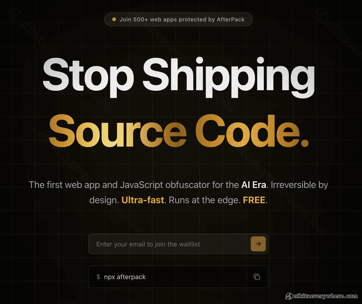
While my JavaScript obfuscator SaaS was still being built, the landing page — the presentation — was already collecting signups and answering "where will the traffic come from?" Four blog posts, a few link drops across the web, and about $500 of Google Ads later (my generous overpayment for some eyeballs and a few learnings), signups now arrive on their own, organically — a few per day.
I ran the same play years ago with DataUnlocker: capturing intent early compounds while you sleep. It's the laziest version of doing things that don't scale. And it matters more now — when anyone can ship a working prototype over a weekend with an AI agent, building the right thing and distributing it matter most. Validate that first.
Why this "lazy feedback" UX approach works 100%
This is the part that actually gets 100% of users to leave feedback.
When someone types in their email, they've already handed you the most valuable thing they have: their "yes." They want the follow-up. They're past the cold-visitor stage — they raised their hand for a modern JavaScript obfuscator.
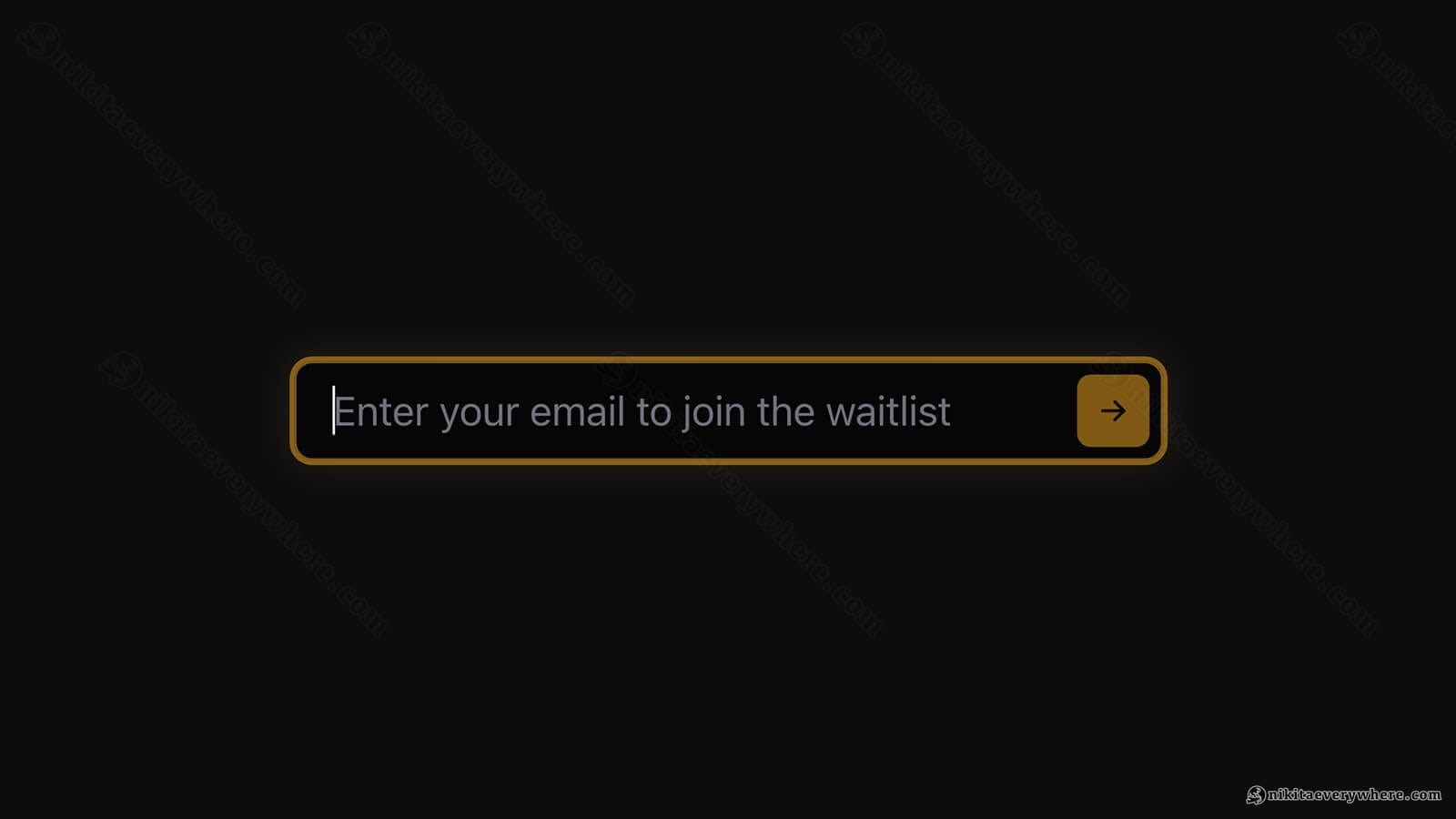
My first signup form UX wasted that. It asked, basically, "anything else you'd like to add?" — an open question that makes a busy person stop and think. Most of them, very reasonably, decide it isn't worth it and skip: "no thanks, I just want the product when it's ready," leaving me without any learnings about who my first high-intent users are.
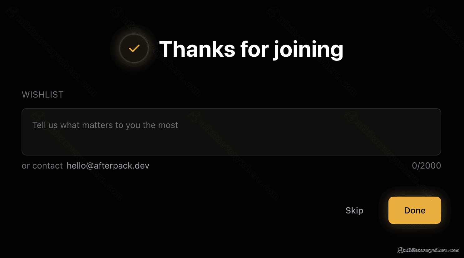
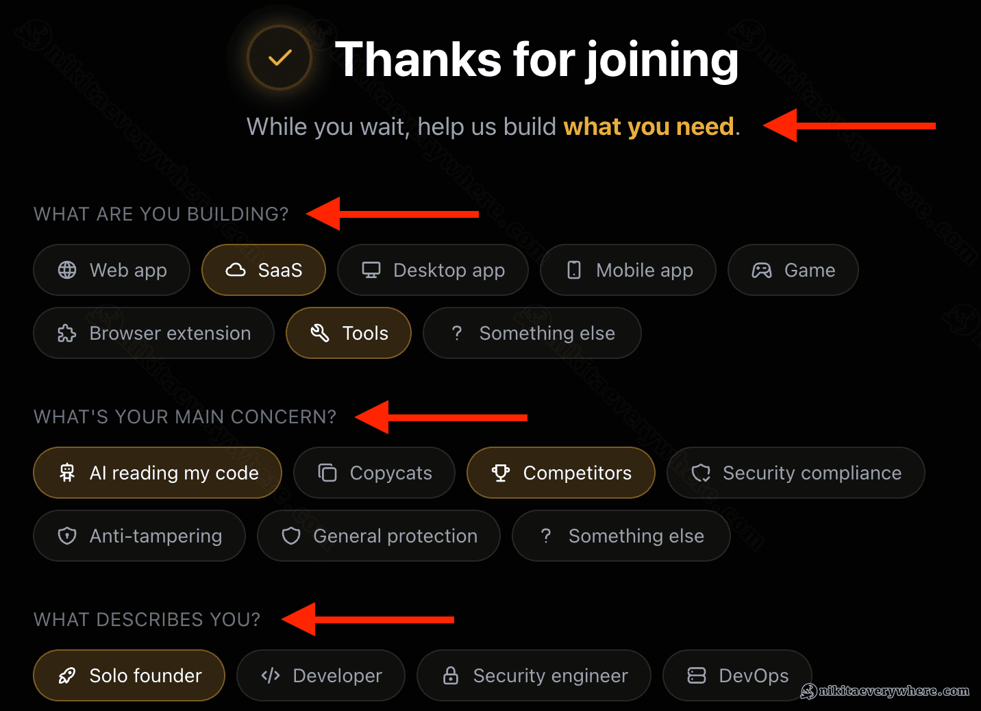
So, after such a low response rate, I swapped the open box for something they can answer without thinking — who are you, what do you build — but as chips to tap, not a field to fill. After the email, the screen just says "Thanks! While you wait, help us build what you need" and offers a few one-tap options.
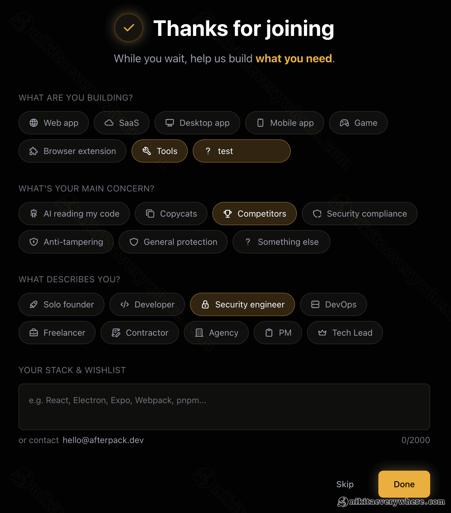
Typing is work; tapping is a reflex. It's the same instinct as reaching for your wallet after a meal — you don't deliberate, you just do it, because you agreed to the deal when you sat down. That's why this hits 100% and a blank box never will. (The free-form field is still there underneath, and it now gets 10–20%, up from under 10% — but the chips are still the part everyone touches.)
I'll be honest: I didn't run a clean A/B test, so treat the exact percentages as directional. The gap isn't subtle, though, and the mechanism is well understood — remove the friction and people act.
The whole story in one picture
Same signups, three ways to build the one screen right after someone hands over their email:
- No feedback form at all — a welcome email, and you still don't know who joined. I hope you're not in this group!
- Open-ended feedback form — ask an open question, and almost no one answers.
- Interactive feedback chips — give one-tap options, and everyone leaves feedback naturally.
The takeaway: when a user gives you their email, that's already a "yes" — so use the moment to get real data. Make answering a reflex — so dead simple that people would feel stupid not to.
Spend the extra hour
If your waitlist collects only emails, you're sitting on your one free shot and not taking it. The screen after "yes" is the cheapest place you'll ever have to learn who's waiting and why — and most products spend it on a "thanks, we'll be in touch." An hour of design there turned a pile of anonymous emails into a steady read on exactly who my future users are, while the product itself is still being built.
P.S. If a friend of yours is building a waitlist right now, go send them the link to this article! Thank me later :)